
Invicta Racing and Eurol join forces in a technica...
Eurol and Invicta Racing launch a technical F2 partnership with SYNGIS Technology for greater performance, efficiency, and reliability in Formul...
July 14, 2022
A new corporate identity comes with a refreshing logo, matching the DNA of Eurol. The Eurol logo has been subtly changed and refreshed without losing any of its recognizability. The readability of the logo has been improved. A darker shade of blue gives the logo more contrast. The brand promise 'Quality is in Our Nature' has been changed to 'Powering Performance' and is therefore perfectly in line with our ambitions. The pay-off Powering Performance is used next to the logo. This sentence communicates in a few words what Eurol stands for.
In addition, the Eurol Wave, colors and typography have been adapted. These are recognizable elements of the Eurol corporate identity. You can find all corporate identity guidelines on the Brand Portal.
The new corporate identity will be introduced gradually. In the coming period it will be used more and more. The phased transition means that the old and new house styles will temporarily be used side by side. If you have any questions about the new house style and the guidelines, please contact marketing@eurol.com.
Eurol and Invicta Racing launch a technical F2 partnership with SYNGIS Technology for greater performance, efficiency, and reliability in Formul...
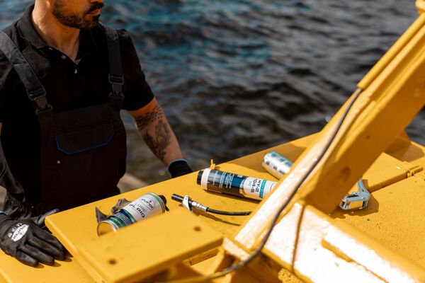
Powerful and sustainable lubrication for heavy-duty applications. Discover three new bio-lubricants with SYNGIS Technology that deliver top performance under all conditions...
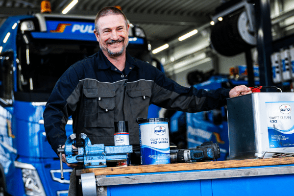
Discover the Eurol Swift Clean HD Wipes for effortless cleaning water and the Swift Clean 130 - now also available in a 20L can for high-volume users.
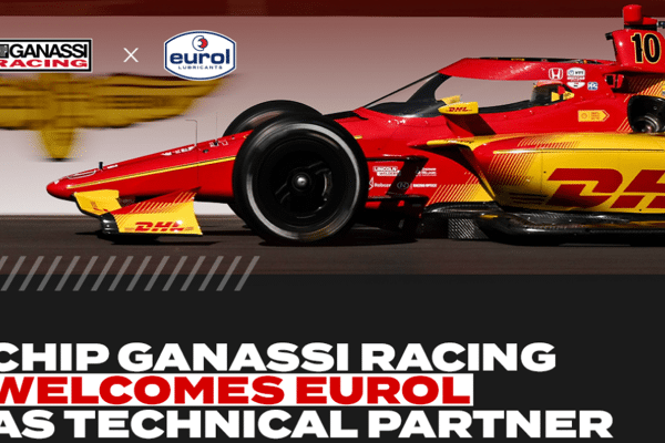
Eurol will partner with Chip Ganassi Racing as a technical partner for the 2025 INDYCAR SERIES season.
Eurol and Invicta Racing launch a technical F2 partnership with SYNGIS Technology for greater performance, efficiency, and reliability in Formul...
Powerful and sustainable lubrication for heavy-duty applications. Discover three new bio-lubricants with SYNGIS Technology that deliver top performance under all conditions...
Discover the Eurol Swift Clean HD Wipes for effortless cleaning water and the Swift Clean 130 - now also available in a 20L can for high-volume users.
Eurol will partner with Chip Ganassi Racing as a technical partner for the 2025 INDYCAR SERIES season.